Happy Thanksgiving to U.S. peeps! I hope the day is a good one and as stress-free as possible, given… everything.
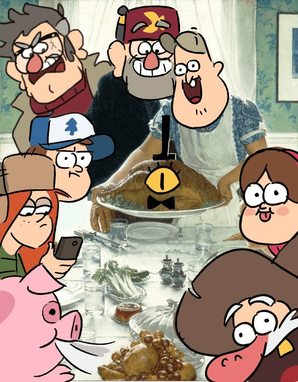
Last year around Halloween I first did a piece with Stan and Ford encountering these Cornstalk Men while traveling in New Jersey. I’d wanted to do a sequel, but wasn’t able to get it done for this year’s Halloween. But, the Cornstalk Men, while undeniably eerie, are certainly a Harvest Spirit kind of a deal, so Thanksgiving seems like an appropriate time to visit with them. (In fact, I had intended to do a whole background for this, basing it on the Corn Maze location that the gang visited in Roadside Attraction, on the theory that Stan and Ford got an introduction to the Oregonian Cornstalk Men from their NJ bretheren…. but obviously I didn’t manage that. Ah well.)
I can’t take credit for the pun of Dipper’s sweater. I was googling for ideas and a bunch of shirts in that vein popped up, and I knew immediately that I had to use it.
Of course I paid a visit to the originals in October:
I would usually link to the past Cornstalk Men posts, but because Tumblr is being a butt about linking right now, I will instead say that if you go to this post on my blog, you can hit the “cornstalk men” tag to see the previous posts. (Including an explanation behind these things.)
So like I used to like the idea of The Office Type. It wasn’t perfect, but I defended it for its well-meaning presentation. Then I kinda fell out of love with it for its (likely accidentally but still) racist caricatures and hadn’t heard from it in months.
Recently however, I got to thinking about it again, and wondered if it was still even in development after the massive backlash it got for the aforementioned racist character depictions (among a few other things). And to my surprise, it was!
And all I can say is… wow. They really stepped up their game and took the criticisms to heart, with I think great results.
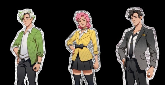
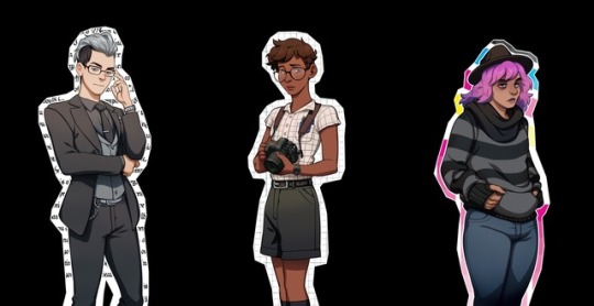
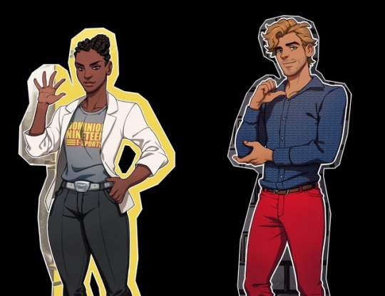
The character designs are all varying even if they’re the same type (ex. The pencils, who were once all the same pink, yellow, green color scheme, are now all different).
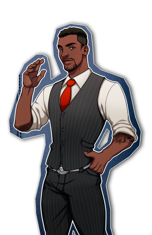
The black characters have had all their previous aggressive demeanors and other stereotypical character traits removed, or incorporated into less “violent”, but still physical activities, like sports.
(Also they went from three hole punches to binders bc everyone thought people with three holes in them was just… stupid.)
The non-binary characters all now have more identity outside of being just “non-binary”, actually exploring the different genders under the nb umbrella, rather than just treating “non-binary” as a “third gender”.
The trans characters are also treated and designed respectfully and unfetishized (cough rcdart cough).
All in all, I’d say, despite a very rocky start, the people at Heavy Thoughts Studios have taken the criticisms of The Office Type’s early phases and applied them to the best of their ability. Hopefully this upward trend will continue, and The Office Type can be a respectable game depicting different LGBTQ elements.
Redemption arc
i reblogged this once but after checking out their website and the characters, not only do they have specific nonbinary identities that are fairly recently defined (such as demiboy/girl), but for the male/female options, some of them are also transgender! they also provide pronouns for the binary genders. Speaking of pronouns, some of the nonbinary characters also use neopronouns, and some characters are also fans of no pronouns at all.
like they really did put in a lot of effort and thats awesome